Kuku
Hydration app
Kuku is a hydration-tracking app designed for how people actually drink: a morning coffee, a prebiotic soda with lunch, tea at night, plus all the water in between.
Instead of nagging people about missed water goals, Kuku turns every beverage into clear, easy-to-read patterns and gently nudges users toward healthier ratios over time.
The product combines a mascot inspired by Kukulkan—a benevolent feathered serpent deity tied to the natural water cycle—with a dark-mode-first, minimal UI that feels calm and modern rather than clinical.
Kuku is a hydration-tracking app designed for how people actually drink: a morning coffee, a prebiotic soda with lunch, tea at night, plus all the water in between.
Instead of nagging people about missed water goals, Kuku turns every beverage into clear, easy-to-read patterns and gently nudges users toward healthier ratios over time.
The product combines a mascot inspired by Kukulkan—a benevolent feathered serpent deity tied to the natural water cycle—with a dark-mode-first, minimal UI that feels calm and modern rather than clinical.

The problem
Most hydration apps assume “hydration = water,” which misrepresents how people actually consume fluids and makes tracking feel like a chore or a constant failure state.
Users juggle long shifts, family responsibilities, and creative work, and when an app only counts water, everything else—from coffee to juice to tea—either disappears or gets logged awkwardly.
Kuku set out to solve two linked problems: make it effortless to log any beverage, and surface the relationship between water and non-water intake so users can shift habits gradually instead of being punished for realistic routines.
The research
I began with a competitive sweep of hydration and wellness tracking apps, documenting patterns around water-only logging, light-mode defaults, sterile visual language, and reminder strategies that felt nagging rather than supportive.
In parallel, I explored fluid-intake behavior—how often people drink non-water beverages, what they actually remember to log, and where friction causes abandonment—then used informal focus groups and peer evaluations to test early concepts for logging flows and dashboard clarity.
For the brand, I researched Kukulkan and related Mesoamerican symbolism during and after a trip to Mexico City, studying temples, artifacts, and metro art to anchor Kuku’s mascot and story in a respectful, historically informed visual language instead of generic “water mascot” tropes.

Brand evolution
Kuku’s brand direction emerged through several iterations that tested different balances of illustration, product logic, and tone.
Early concepts like Aqua Amingo focused heavily on a friendly water-centric illustration, then Fluid stripped the interface down to emphasize complete liquid intake tracking across all beverages, while Brim brought back warmth and myth-inspired art but needed tighter integration with the product’s core flows.
Kuku represents the synthesis: a mascot-led identity grounded in Kukulkan’s role in the natural water cycle, paired with typography and color inspired by Mexican holiday-industry graphics and a calm, resort-like palette, all designed to make hydration tracking feel inviting rather than clinical.
Process / iterations
From the Fluid phase onward, I treated Kuku as a product-driven project, building out wireframes and prototypes that emphasized two primary planes of interaction: a dashboard for understanding the day at a glance and a fluid log drawer for fast, customizable logging.
Each iteration refined layout and grid theory—establishing a modular system that could accommodate progress bars, streak markers, daily logs, and user-selectable widgets—while usability feedback pushed the design toward fewer taps, clearer hierarchy, and more forgiving defaults.
In parallel, the logo, wordmark, and typography system evolved: I moved from more decorative treatments to a compact mascot icon built using aspective art principles and a rounded, movement-oriented wordmark font, then paired them with a clean secondary sans-serif for UI labels to keep the product fast and legible.

Key decisions
One of the most important decisions was to expand shortcut beverages beyond water: users can fully customize the quick-access drinks in the drawer, reflecting their real intake (coffee, matcha, soda, tea, etc.) instead of forcing everything through a water-only lens.
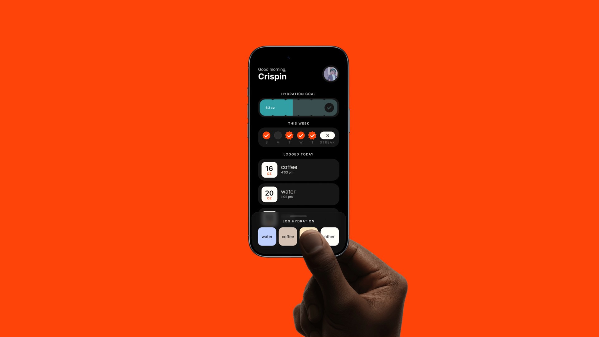
I anchored the interaction model around a persistent, partially-open drawer fixed at the bottom of the screen, so users can always log a drink in one tap while the dashboard remains scrollable for reviewing today’s and past data—a structure that meaningfully reduces friction compared to modal pop-ups or buried logging flows.
On the data side, I added a 70% water threshold marker to the progress bar, awarding a subtle “star” when most intake is water, and chose a dark-mode-first aesthetic both for comfort (less glare in real-world use) and to stand out from the overwhelmingly light-mode competition.
Final design
The final Kuku experience is organized around two planes: the dashboard and the fluid log drawer, designed to work together without competing for attention.
On the dashboard, users see a daily hydration goal and progress bar, streak indicators, a running log of entries near the top for quick confirmation, and a customizable widget area where they can prioritize metrics like caffeine, sugar, or water ratio based on their own health goals.
The fluid log drawer launches semi-open with a translucent background that hints at the dashboard beneath, offers user-defined quick-access beverages with common sizes and a flexible input for anything more specific, and keeps Kuku’s tone calm, encouraging, and a little playful throughout the experience.
Outcomes & reflection
Kuku demonstrates my ability to take a self-initiated idea through a full product-design process: framing a real behavioral problem, researching the market and cultural context, iterating across brand and UX, and arriving at a cohesive system that feels both friendly and production-ready.
The project strengthened my approach to combining brand and product decisions—designing mascot, typography, layout, and interaction patterns together instead of in separate tracks—which I now apply to more complex digital work like web experiences and multi-screen flows.
If I were to push Kuku further with a team, my next steps would be structured user testing around logging frequency, A/B testing the drawer’s default state, and exploring multi-platform extensions (widgets, wearables) to keep hydration insights visible without adding cognitive load.
© Xavier Armando