Dutch Bros | The Desktop Experience
I wanted to redesign Dutch Bro's web presence with a more modern feel while still maintaining their unique brand & energy, and improve their usability & accessibility.
To begin this project, I conducted surveys where consumers could convey their feelings about the brand, its offerings, and their experiences with the company's website on both a desktop and mobile setting. The data collected in this survey was the basis for my changes to site navigation and organization, as well as additional requested features.
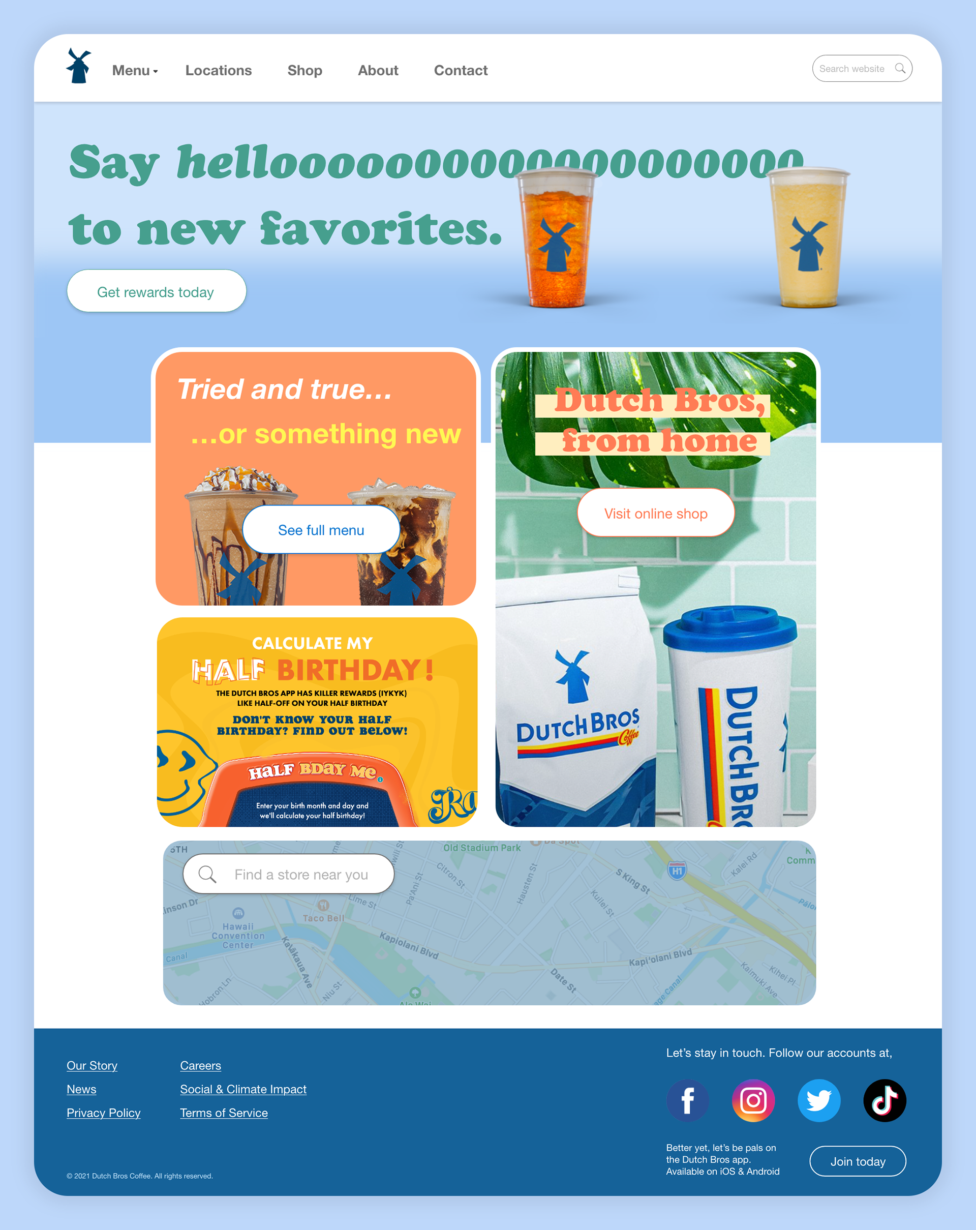
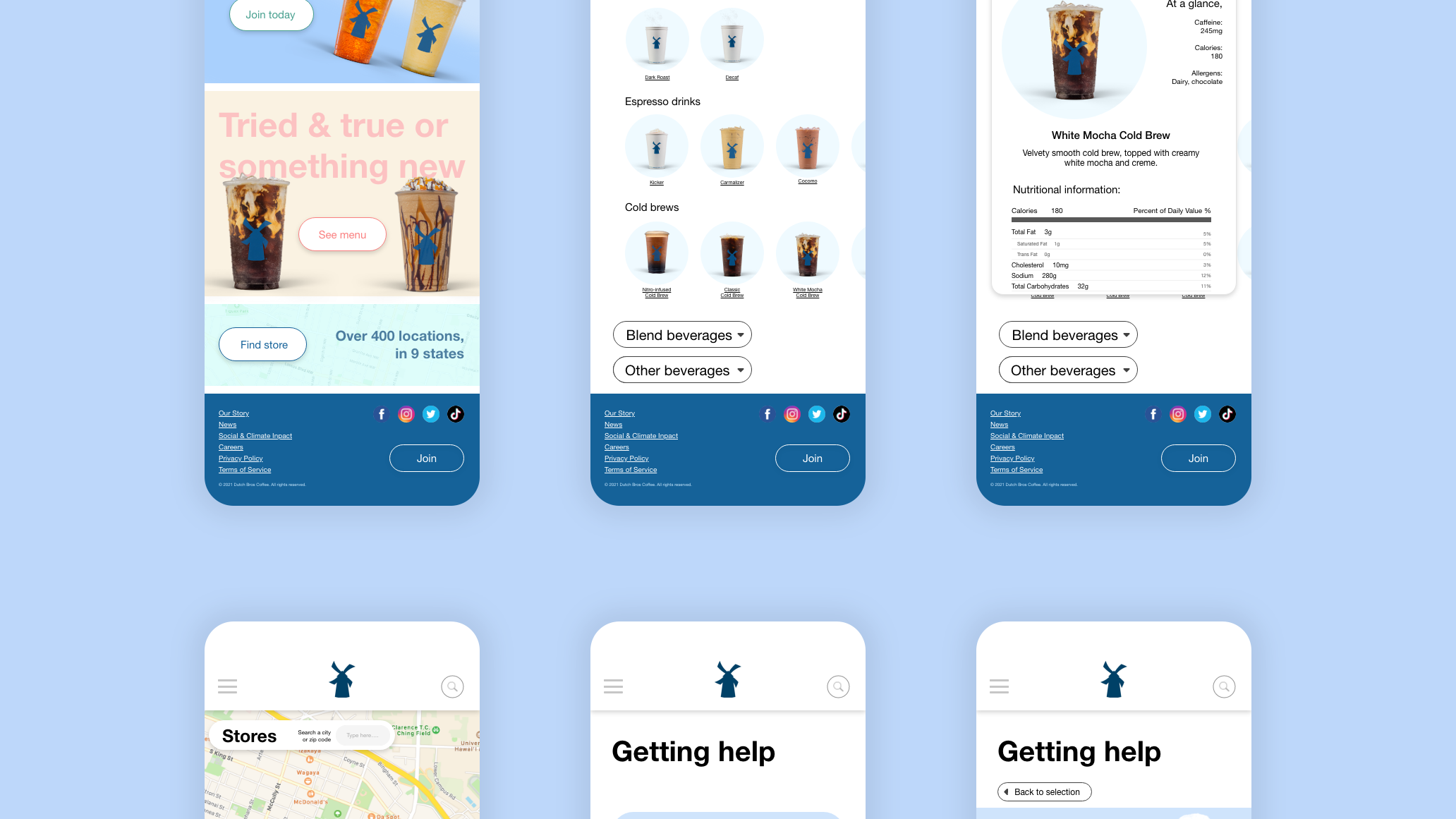
We've envisioned the Dutch Bros homepage with a brighter, bolder, and more cohesive design. Here we can highlight new offerings from the company as well as provide quest access to commonly visited areas such as store locations, online store, and menu.
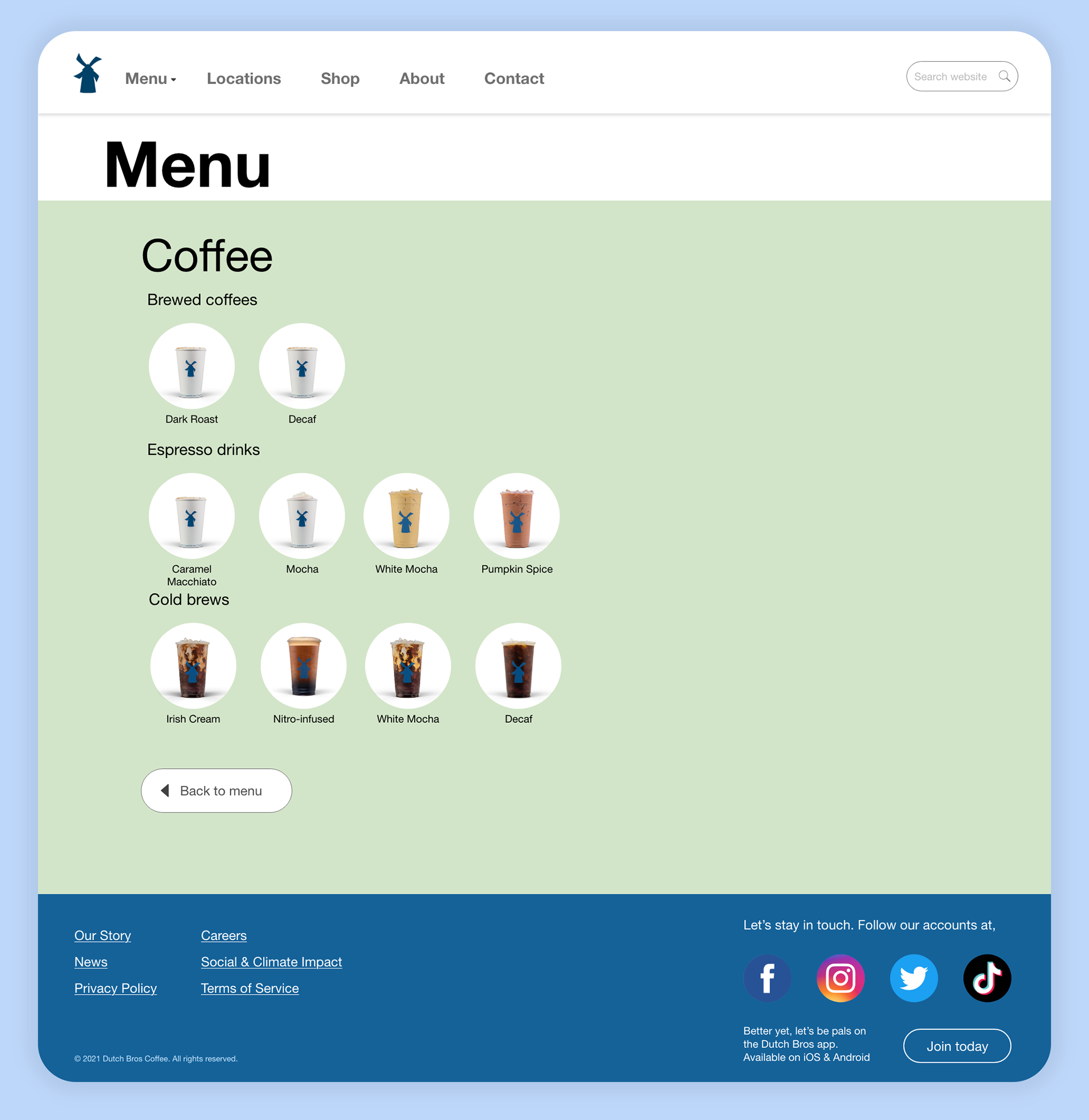
I've redesigned the menu, creating simpler categories for their beverages. We also adapt a new light green color, which was inspired by various color of the year awards for similar shades, such as Sherwin-Williams & Benjamin Moore, and the general association of green with health and quality.
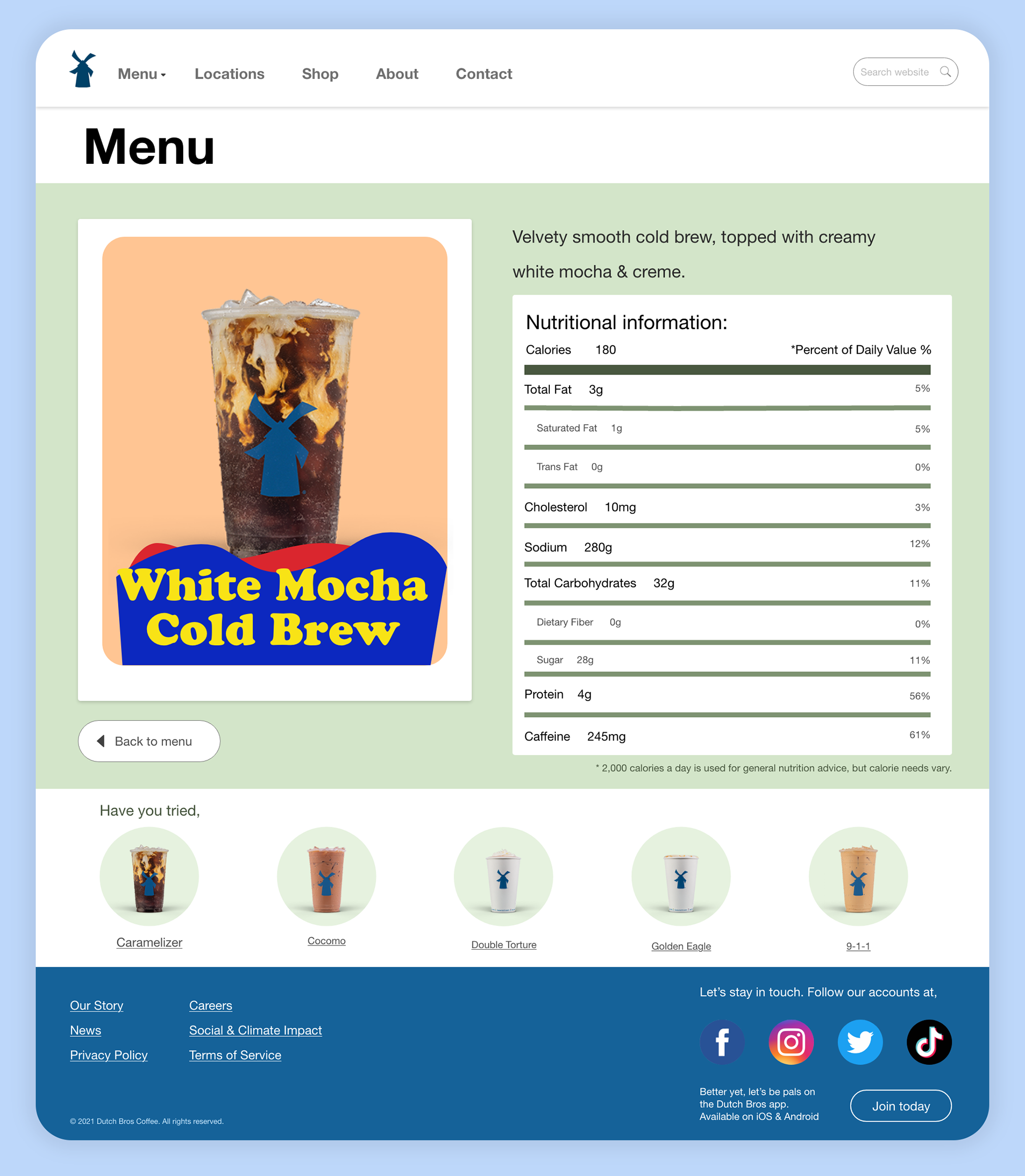
Users can now view even more information about drinks including nutritional information which is now presented in a more familiar and typical format for the consumer. This skeuomorphic design helps the user spend less time reading so they can more easily find the information they need to choose their perfect beverage.
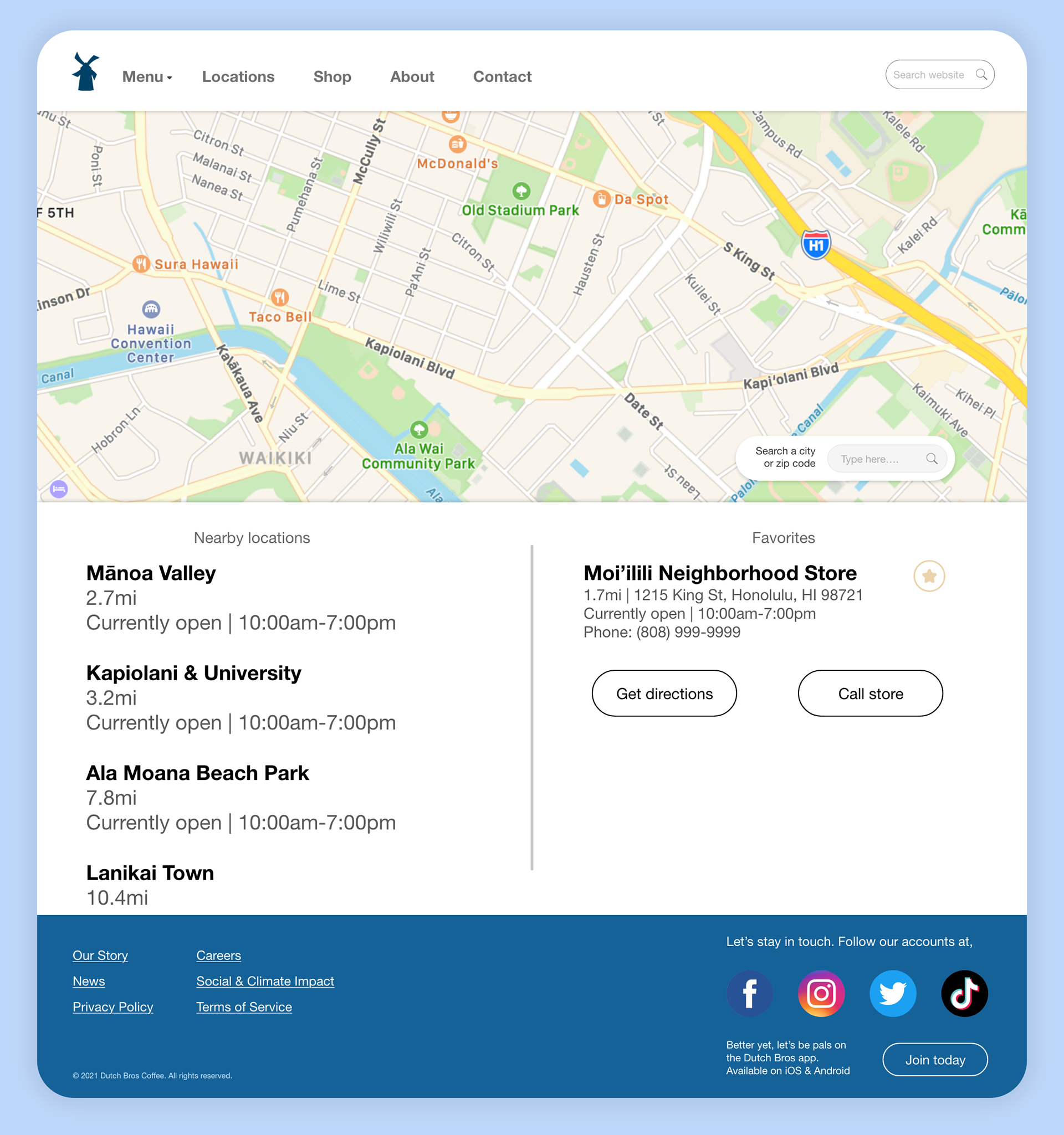
I've organized the store locater page to be more familiar in today's setting with a user-centered design. Here the user can enjoy more personalized and convenient information, including saving locations for later, contacting, and comparing proximity.
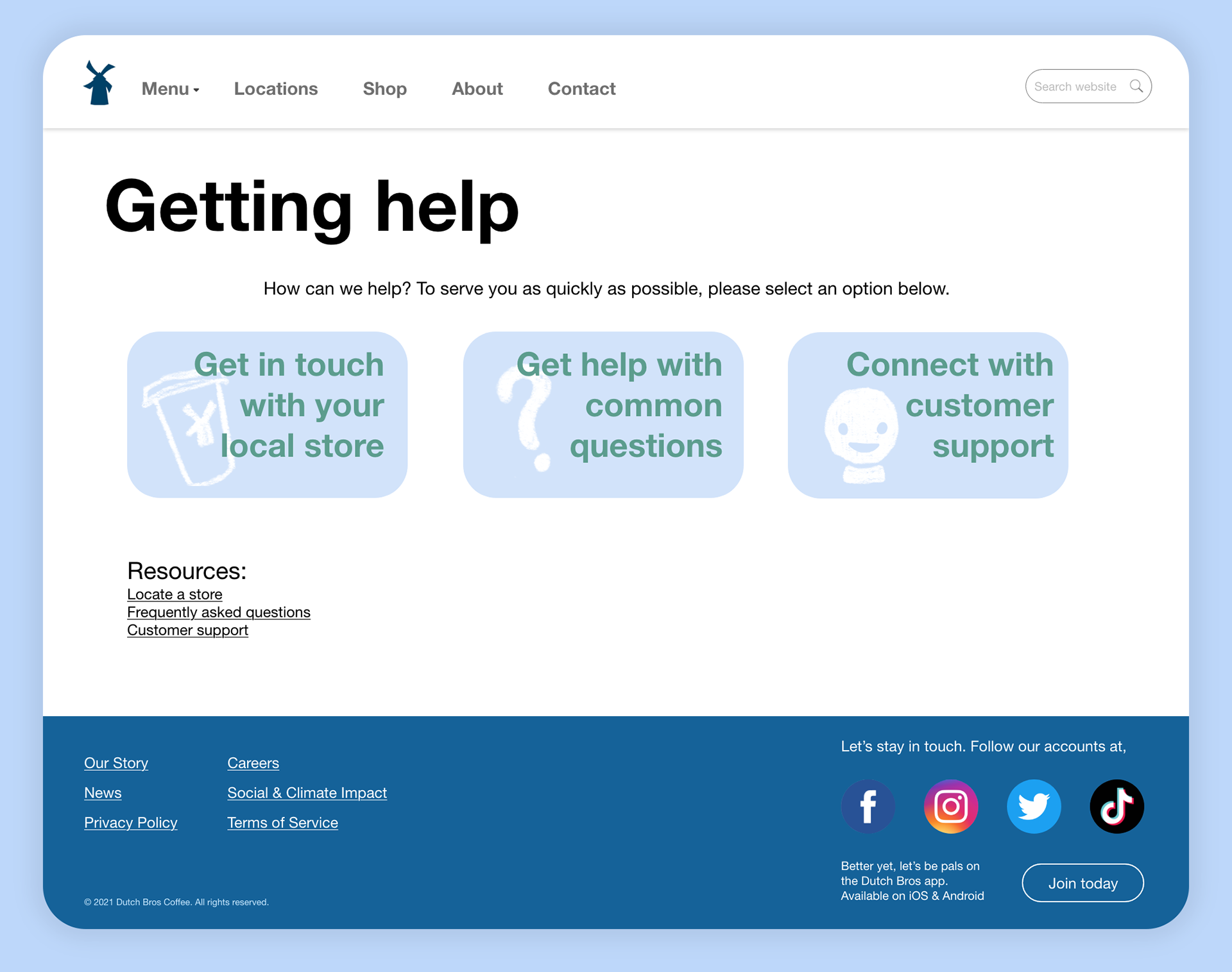
One of the biggest areas in need of improvement was the contact and help areas of the website, so this was one of my biggest focuses. Here I've divided contact into the three most common but distinct paths for the user, as well as referencing other resources in case the user isn't immediately certain.
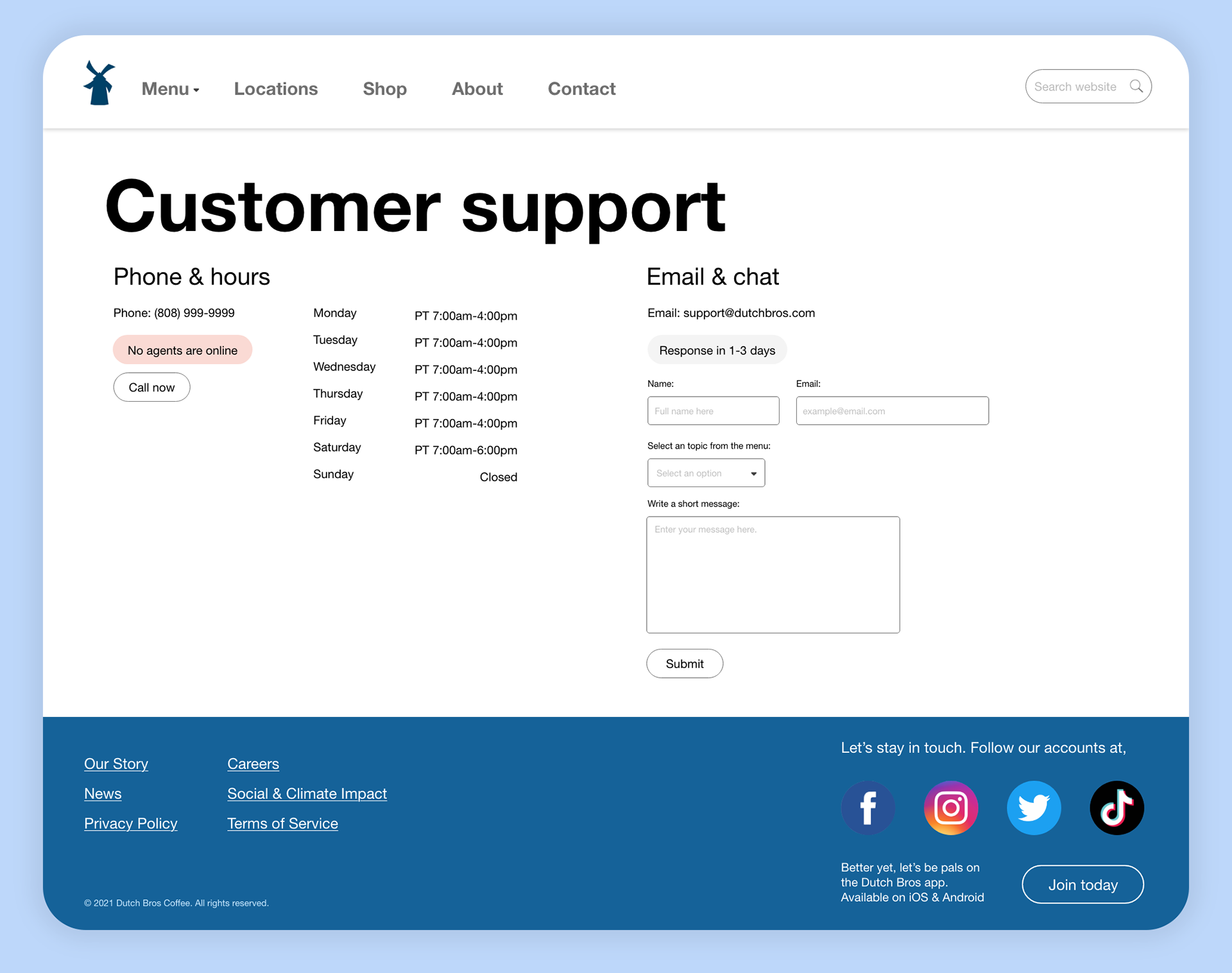
In the surveys, one of the most commonly cited areas of frustration was not being able to easily find a number or email to contact – Hidden behind many pages of troubleshooting and FAQs. Here, I've made this information clear & transparent. Additionally, we've added curtesy features, such as a call now button, email response time, and agent availability so the user doesn't have to wait after a number of phone number menus only to get the message that they're no agents online.